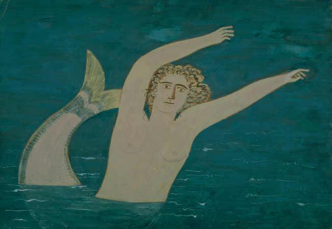
Mermaid, c.1972
In a form of painting which is purely anthropocentric, the individual course followed by Nikos Nikolaou can be traced, supported as it was by a profound knowledge and study of, as well as dedication to, principles and rules of ancient Greek, Roman, and Egyptian art, but also features from the folk tradition, which he had experienced intensely both on his native Hydra, and in his mother's antique shop. The human form, male or female, is projected imposingly, with rugged and clear outlines: to begin with, in single colour surfaces without chiaroscuro which take on sensibilities and tonicities only from the diffuse light of nature; later, by a light or more intense chiaroscuro, but it is always monumental, with marked plasticity and hieratic grandeur. The primeval relationship between man and woman is rendered by a limited range of earthy colours which suggest a serene atmosphere of inner communication. In his last 20 years his insistence on the depiction of the female figure only, with a monumental stillness and a ritual gesture, referred back to the Mother-Goddess, symbol of fertility and creativity. And it is precisely this which is stressed particularly in his great series of stones, in which he made use of the natural formation which the sea or the wind had bestowed upon matter, and by means of a very few linear interventions gave them flesh, life, spirit.
Mermaid, although is not dated, we can say with virtual certainty that it was produced around 1972, since it shares characteristics with works which date from that period, particularly in fresco. A basic quality of these works is the weightlessness of the depiction, with light chiaroscuro on the body or the face. The hair is depicted by rapid, free brush-strokes, while the dilute paint lends transparency and fluidity to the composition. Whether his painting belongs within his usual subject-matter, or whether he is portraying landscapes from his beloved Hydra, or mermaids, ships, or pitchers, everywhere the same abstractive approach, both in the use of the line in the design and in the sparing placing of the paint without tonal gradations, predominates.